Figures Primer (Matplotlib)#
This primer is a reference for creating figures that support your reasoning in physics problems.
In this course, figures are used to:
define a coordinate system,
show vectors and components,
visualize functions or data,
illustrate areas under curves (integral meaning),
and (optionally) create short animations.
You do not need to memorize plotting syntax. Use this notebook as a template and copy patterns when needed.
In class: we will focus mainly on plotting functions and data.
The other sections are here so you can return to them later.
Setup#
import numpy as np
import matplotlib.pyplot as plt
# For nicer default sizing in notebooks
plt.rcParams["figure.figsize"] = (7, 4)
plt.rcParams["figure.dpi"] = 120
Plotting Functions and Data#
A good physics figure answers a question and supports a specific claim. In scientific and engineering work, the explanation of a figure is typically provided in the figure caption, not in the plot itself. As a result, plots generally do not use titles.
Instead, a well-constructed figure should include:
axis labels with units,
readable scales,
a legend or annotation that identifies what is being shown.
The goal is that someone can understand how to read the figure even before reading the caption.
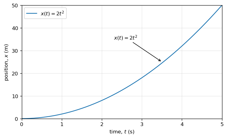
Example: Plot a function#
We will plot the function \(x(t) = 2t^2\) from \(t=0\) to \(t=5\,\text{s}\), and label the curve directly on the figure.
import numpy as np
import matplotlib.pyplot as plt
# Define the function x(t) = 2 t^2
t = np.arange(0, 5.0 + 0.025, 0.025) # time in seconds
x = 2 * t**2 # position in meters
# Create figure and axes
fig = plt.figure()
ax = fig.add_subplot(111)
# Plot the data
ax.plot(t, x, label=r"$x(t)=2t^2$")
#Set axis limits to reduce white space
ax.set_xlim(0,5)
ax.set_ylim(0,50)
# Label axes with units
ax.set_xlabel("time, $t$ (s)")
ax.set_ylabel("position, $x$ (m)")
# Identify the curve; use either legend or annotate in practice
ax.legend()
ax.annotate(r"$x(t)=2t^2$",xy=(3.5, 25),
xytext=(2.3, 35),arrowprops=dict(arrowstyle="->"))
# Optional visual aids
ax.grid(True, alpha=0.3)
plt.show()
#use fig.savefig("myfile.png",bbox_inches='tight) to save figure to a file
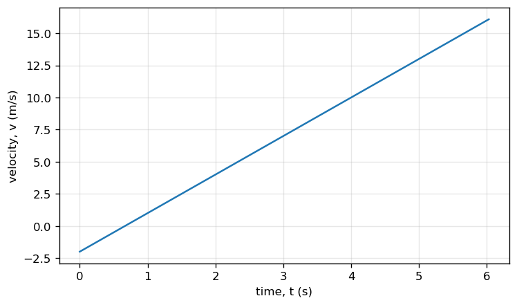
Mini Exercise 1#
Plot the function
from \(t=0\) to \(t=6\,\text{s}\). Label axes with units and include a legend or annotation.
# TODO: Mini Exercise 1
t = np.arange(0, 6.0 + 0.03, 0.03)
v = 3*t - 2
fig = plt.figure()
ax = fig.add_subplot(111)
ax.plot(t, v)
ax.set_xlabel("time, t (s)")
ax.set_ylabel("velocity, v (m/s)")
ax.grid(True, alpha=0.3)
plt.show()
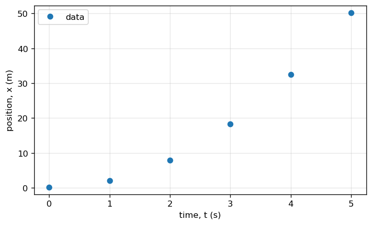
Example: Plot data with markers#
Sometimes you have measured data points. Use markers so the points are visible.
# Example data (time in s, position in m)
t_data = np.array([0, 1, 2, 3, 4, 5])
x_data = np.array([0.2, 2.1, 7.9, 18.3, 32.5, 50.2])
fig = plt.figure()
ax = fig.add_subplot(111)
ax.plot(t_data, x_data, "o", label="data")
ax.set_xlabel("time, t (s)")
ax.set_ylabel("position, x (m)")
# Tight limits to reduce excess whitespace
ax.set_xlim(t_data.min() - 0.25, t_data.max() + 0.25)
ax.set_ylim(x_data.min() - 2, x_data.max() + 2)
ax.grid(True, alpha=0.3)
ax.legend()
plt.show()
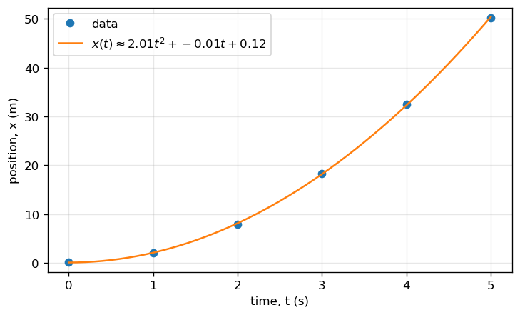
Mini Exercise 2#
On the same axes, plot the data points and a model curve of your choice (for example, a quadratic fit).
Explain (in a Markdown cell) what your model represents physically.
# TODO: Mini Exercise 2 (one possible approach: polynomial fit)
t_data = np.array([0, 1, 2, 3, 4, 5])
x_data = np.array([0.2, 2.1, 7.9, 18.3, 32.5, 50.2])
# Fit a quadratic model x(t) = a t^2 + b t + c
coeff = np.polyfit(t_data, x_data, deg=2)
a, b, c = coeff
t_fit = np.arange(t_data.min(), t_data.max() + 0.025, 0.025)
x_fit = a*t_fit**2 + b*t_fit + c
fig = plt.figure()
ax = fig.add_subplot(111)
ax.plot(t_data, x_data, "o", label="data")
ax.plot(t_fit, x_fit, "-", label=rf"$x(t)\approx {a:.2f}t^2 + {b:.2f}t + {c:.2f}$")
ax.set_xlabel("time, t (s)")
ax.set_ylabel("position, x (m)")
# Tight limits to reduce excess whitespace
ax.set_xlim(t_data.min() - 0.25, t_data.max() + 0.25)
ax.set_ylim(x_data.min() - 2, x_data.max() + 2)
ax.grid(True, alpha=0.3)
ax.legend()
plt.show()
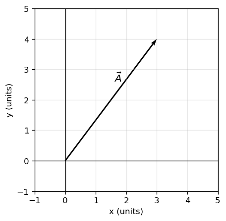
Drawing Vectors (Arrows and Annotations)#
Vectors are best shown when you:
choose and label axes,
draw the arrow from a clear tail point,
and label the vector (and/or components).
Two common tools:
plt.quiver(...)for vector arrowsplt.annotate(...)for custom arrows and labels
# Example: a vector from the origin to (3,4)
x, y = 3, 4
fig = plt.figure()
ax = fig.add_subplot(111)
ax.axhline(0, color="k", linewidth=0.8)
ax.axvline(0, color="k", linewidth=0.8)
ax.quiver(0, 0, x, y, angles="xy", scale_units="xy", scale=1)
ax.text(0.6*x - 0.2, 0.6*y + 0.2, r"$\vec{A}$", fontsize=12)
ax.set_xlim(-1, 5)
ax.set_ylim(-1, 5)
ax.set_aspect("equal", adjustable="box")
ax.set_xlabel("x (units)")
ax.set_ylabel("y (units)")
ax.grid(True, alpha=0.3)
plt.show()
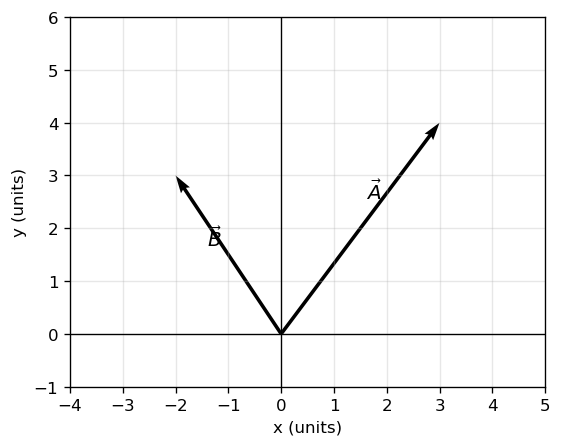
Mini Exercise 3#
Draw two vectors from the origin, \(\vec{A}=(3,4)\) and \(\vec{B}=(-2,3)\), and label them.
# TODO: Mini Exercise 3
A = np.array([3, 4])
B = np.array([-2, 3])
fig = plt.figure()
ax = fig.add_subplot(111)
ax.axhline(0, color="k", linewidth=0.8)
ax.axvline(0, color="k", linewidth=0.8)
ax.quiver(0, 0, A[0], A[1], angles="xy", scale_units="xy", scale=1)
ax.quiver(0, 0, B[0], B[1], angles="xy", scale_units="xy", scale=1)
def label_vector(ax, vec, label, frac=0.6, offset=0.25):
# Place label along the vector with a small perpendicular offset
v = np.array(vec, dtype=float)
base = frac * v
# Perpendicular direction
perp = np.array([-v[1], v[0]], dtype=float)
n = np.linalg.norm(perp)
if n != 0:
perp = perp / n
pos = base + offset * perp
ax.text(pos[0], pos[1], label, fontsize=12)
label_vector(ax, A, r"$\vec{A}$")
label_vector(ax, B, r"$\vec{B}$")
ax.set_xlim(-4, 5)
ax.set_ylim(-1, 6)
ax.set_aspect("equal", adjustable="box")
ax.set_xlabel("x (units)")
ax.set_ylabel("y (units)")
ax.grid(True, alpha=0.3)
plt.show()
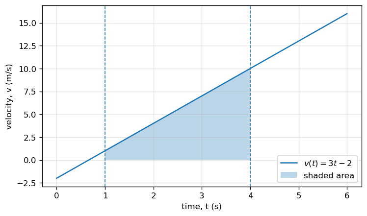
Shading Area Under a Curve#
Shading is useful when an area has physical meaning, such as:
displacement as the area under a velocity–time curve,
work as the area under a force–displacement curve,
impulse as the area under a force–time curve.
Use plt.fill_between(...).
# Example: shade displacement under v(t) from t=1 to t=4
t = np.arange(0, 6.0 + 0.015, 0.015)
v = 3*t - 2
t1, t2 = 1, 4
mask = (t >= t1) & (t <= t2)
fig = plt.figure()
ax = fig.add_subplot(111)
ax.plot(t, v, label=r"$v(t)=3t-2$")
ax.fill_between(t[mask], v[mask], alpha=0.3, label="shaded area")
ax.axvline(t1, linestyle="--", linewidth=1)
ax.axvline(t2, linestyle="--", linewidth=1)
ax.set_xlabel("time, t (s)")
ax.set_ylabel("velocity, v (m/s)")
ax.grid(True, alpha=0.3)
ax.legend()
plt.show()
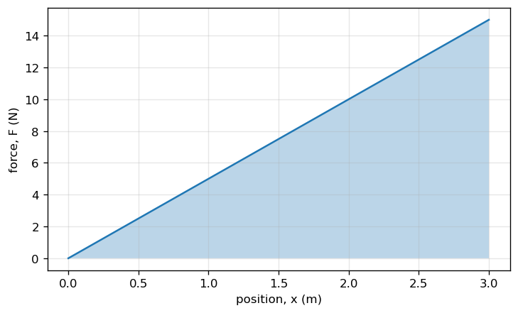
Mini Exercise 4#
Shade the area under \(F(x)=5x\) from \(x=0\) to \(x=3\,\text{m}\).
Write one sentence: what does this shaded area represent physically?
# TODO: Mini Exercise 4
x = np.linspace(0, 3, 300)
F = 5*x
fig = plt.figure()
ax = fig.add_subplot(111)
ax.plot(x, F, label=r"$F(x)=5x$")
ax.fill_between(x, F, alpha=0.3)
ax.set_xlabel("position, x (m)")
ax.set_ylabel("force, F (N)")
ax.grid(True, alpha=0.3)
plt.show()
Short Animations (Optional)#
Animations are optional, but they can be helpful for visualizing motion or changing vectors.
We will use matplotlib.animation.FuncAnimation. In many notebooks (including Colab),
you can display animations inline using HTML.
If the animation does not display, you can still save it as a GIF (requires pillow) or MP4 (requires ffmpeg).
from matplotlib.animation import FuncAnimation
from IPython.display import HTML
# Example: animate a point moving along x(t)=t, y(t)=sin(t)
t = np.arange(0, 2*np.pi + 0.03, 0.03)
x = t
y = np.sin(t)
fig, ax = plt.subplots()
ax.set_xlim(0, 2*np.pi)
ax.set_ylim(-1.2, 1.2)
ax.set_xlabel("x")
ax.set_ylabel("y")
(point,) = ax.plot([], [], "o")
def init():
point.set_data([], [])
return (point,)
def update(frame):
point.set_data([x[frame]], [y[frame]])
return (point,)
anim = FuncAnimation(fig, update, frames=len(t), init_func=init, interval=30, blit=True)
plt.close(fig) # prevents duplicate static plot display
HTML(anim.to_jshtml())
Mini Exercise 5 (Optional)#
Modify the animation so the point moves on a circle: $\( x(t)=\cos(t),\quad y(t)=\sin(t). \)$
# TODO: Mini Exercise 5 (Optional)
t = np.arange(0, 2*np.pi + 0.03, 0.03)
x = np.cos(t)
y = np.sin(t)
fig, ax = plt.subplots()
ax.set_xlim(-1.2, 1.2)
ax.set_ylim(-1.2, 1.2)
ax.set_aspect("equal", adjustable="box")
(point,) = ax.plot([], [], "o")
def init():
point.set_data([], [])
return (point,)
def update(frame):
point.set_data([x[frame]], [y[frame]])
return (point,)
anim = FuncAnimation(fig, update, frames=len(t), init_func=init, interval=30, blit=True)
plt.close(fig)
HTML(anim.to_jshtml())
Submission Expectations (for figures)#
When you include a figure in an assignment notebook:
Label axes with quantity and units
Explain what the figure is showing in your Markdown (text) cells
If a figure supports a claim, state the claim in words
Keep the figure readable (avoid tiny fonts or crowded elements)
Figures are part of your reasoning. They should make your explanation easier to follow.