1. Thinking Like an Astronomer#
1.1. Mathematical Tools#
The main difference between modern science and prior systems of inquiry is through the use of mathematics to precisely describe the patterns observed. The language of mathematics was developed over centuries to provide a more precise means of communicating ideas. Below are some mathematical ideas that are useful in our study of astronomy:
Scientific Notation: method to conveniently represent numbers that are very large and small. Writing out a large number (e.g., the speed of light in m/s) can be simplified by condensing the unused zeros with a power of 10.
The speed of light \(c\) is often quoted as (rounded to) \(300,000,000\ \rm m/s\). However, this value can be condensed in scientific notation by counting the number of trailing zeros or by counting the number of spaces to move the decimal leftward so that the leading digit is \(3\).
In this case there are \(8\) zeros, so that we can represent \(c = 3 \times 10^8\ {\rm m/s}\), where the number of zeros (or spaces moved leftward) are in the exponent.
The same process can be applied to very small numbers (e.g., the size of the hydrogen atom). The Bohr radius \(a_o\) is \(0.00000000005291\ \rm m\) in decimal form, but in scientific notation it becomes \(5.291 \times 10^{-11}\ \rm m\).
Below is a video demonstrating how to input values in scientific notation into your calculator (using an Iphone). The process is similar for Android phones and other calculators. Additionally there is a demonstration for how to code values in scientific notation in Python.
#speed of light; c = 3 x 10^8 m/s
#wavelength of light; lambda = 500 nm = 5 x 10^-7 m

c = 3e8 #the exoponent from the power of 10 comes after the "e"
lamb = 5e-7 #this notation can include negative exponents too

freq = c/lamb #once coded, you can use the values to perform calculations

print("The frequency of light at 500 nm is %1.0e Hz." % freq)
The frequency of light at 500 nm is 6e+14 Hz.
Units and Ratios: useful way to represent and compare quantities.
Instead of writing that the Sun has a mass of \(1.989 \times 10^{30}\ {\rm kg}\), it is more convenient to represent this value in a new unit: Solar mass \(\equiv 1\ M_\odot\). The \(M_\odot\) tells us when the new unit is being invoked.
Stars cover a wide range in mass, and the new unit allows us to represent a star that is \(10\times\) the Sun’s mass as just \(10\ M_\odot\).
A unit conversion (e.g., \(1000\ {\rm m} = 1\ {\rm km}\)) can be represented as a ratio, or \(\frac{1000\ {\rm m}}{1\ {\rm km}}\).
\[ \frac{3 \times 10^{8}\ {\rm m/s}}{1} \times \frac{1\ {\rm km}}{10^3\ {\rm m}} = 3 \times 10^5\ {\rm km/s} \]Using ratios is also useful in making other calculations (with formulas easier). Suppose you want to know how much more light-gathering power a 30-m telescope has compared to a 3-m telescope. The light-gathering power is proportional to the area, so we just need to compare the areas (from a circle) of the two telescopes. The 30-m telescope has \(100\times\) more light-gathering power as found using a ratio. Note: the value of \(\pi\) canceled and was not needed.
\[ \text{light-gathering power ratio} = \frac{A_{30m}}{A_{3m}} = \frac{\pi 30^2}{\pi 3^2} = \left(\frac{30}{3} \right)^2 = 10^2 = 100. \]Below is a video showing how to use a ratio to solve a problem with intensity and temperature.
Proportionality: useful way to understand how the result of a formula will change with different given values. This is similar to using ratios, but the question is just asked in a different way.
“If you have half as much money, you will be able to buy only half as much gas” is an example of a linear proportion.
“If you double the telescope diameter, you will have four times the light-gathering power (i.e., \(2^2 = 4\)) is an example of a proportion with an exponent.
Below is a refresher video from Khan Academy about proportionality in a general context.
1.2. Reading a Graph#
Scientists (and other technical professionals) often interpret their data using a graph because it’s easier to see the general relationship visually rather than by comparing individual numbers. Graphs typically have two axes: horizontal (independent) and vertical (dependent).
The independent variable represents the quantity for which the scientist can control.
The dependent variable represents the final quantity obtained (from a formula) or measured (by experiment).
Suppose we have some data that describes how far a car moves (i.e., its distance from the start) at different points in time over a trip. When gathering the data, we had control over when to record the distance measurements. Therefore, the independent variable is the time \(t\) describing when we make the measurement (plotted along the horizontal axis). The dependent variable is \(d\) that describes the distance measured at a given \(t\).
Below is a python script (DON’T PANIC) that demonstrates some randomly generated distances (points) and the expectation for how far we would travel assuming a consant speed of \(60\ \rm {kph}\). These values are then graphed to show us visually the relationships.
import numpy as np
import matplotlib.pyplot as plt

np.random.seed(42) #set this so that the results are reproducible

npts = 21
fs = 'large'
v_o = 60 #speed in kilometers per hour (kph)
t = np.zeros(npts)
t[1:] = np.linspace(1,20,npts-1)/60. #measurement time (converted in hours)
d = v_o*t
d_rand = d + 3*(np.random.rand(len(t))-0.5)

fig = plt.figure(figsize=(5,5),dpi=150)
ax = fig.add_subplot(111)

ax.plot(60*t,d_rand,'k.',ms=8,label="(generated) measurements")
ax.plot(60*t,d,'b--',lw=2,label="model")

ax.set_xlabel("Time $t$ (minutes)",fontsize=fs)
ax.set_ylabel("Distance $d$ (km)",fontsize=fs)
ax.legend(loc='best')
ax.grid(True)

ax.set_xlim(0,21)
ax.set_xticks(np.arange(0,25,5))
ax.set_ylim(0,25);
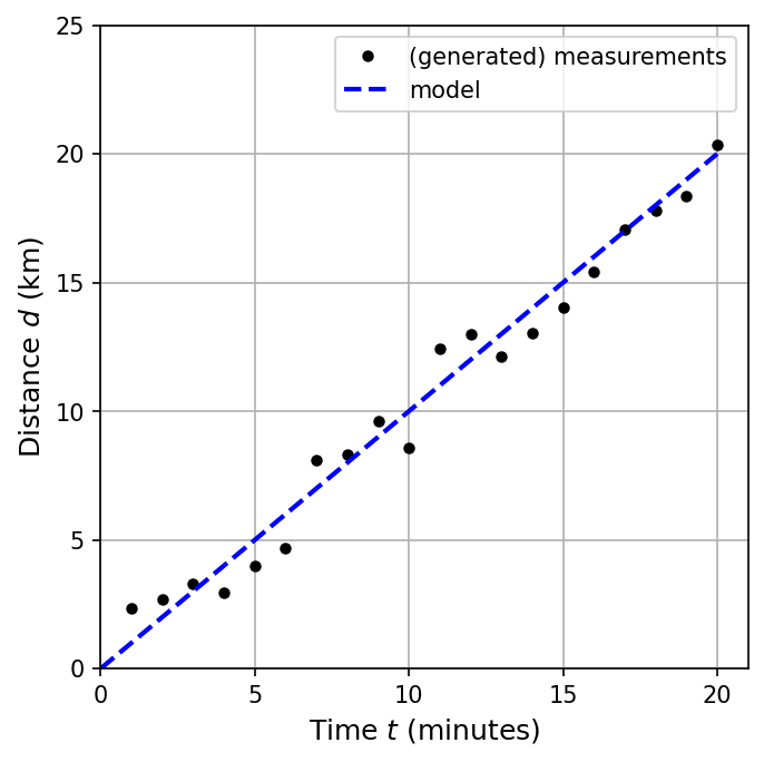
We can analyze the gravph above and recover our initial values.
First, we can find the slope of the line \(m\) using the general formula: \(m = \frac{y_2-y_1}{x_2 - x_1}\), or \(m = \frac{d_2-d_1}{t_2-t_1}\) for our specific problem. To find the slope, we must pick two points on the dashed line, where it is better if they are far apart and easy to read based on the grid lines. We know that we started from the origin \((0,0)\) and ended on \((20,20)\) (using the dashed-line).
The slope of the line is \(1\ {\rm km/min}\), which represents our average speed. But we started with 60 kph! We can convert the minutes to hours:
Finding the \(y\)-intercept \(b\) requires that we use the equation of a line \(y=mx+b\) and one of our points measured off the graph. Let’s use \((20\ {\rm min},20\ {\rm km})\), which gives
\[\begin{align*} 20 &= \left(\frac{1\ {\rm km}}{1\ {\rm min}}\right) (20\ {\rm min}) + b, \\ 20 &= 20 + b, \\ b & = 0. \end{align*}\]
Althought the above example was linear (i.e., followed the equation of a line), not all data turns out that way. The textbook (21st Century Astronomy) provides an example where this is not the case, which we reproduce below (using python).
import numpy as np
import matplotlib.pyplot as plt

ms = 8
npts = 12
fs = 'large'
t = np.arange(0,npts,1) #time steps
num_of_virus =  [2**n for n in range(0,npts)]

fig = plt.figure(figsize=(7,3),dpi=150)
ax1 = fig.add_subplot(121)
ax2 = fig.add_subplot(122)

ax1.plot(t,num_of_virus,'k.',ms=ms)
ax2.semilogy(t,num_of_virus,'k.',ms=ms)

ax1.set_ylabel("Number of viruses",fontsize=fs)
ax1.set_xlabel("Time step",fontsize=fs)
ax2.set_ylabel("Number of viruses",fontsize=fs)
ax2.set_xlabel("Time step",fontsize=fs)

ax1.grid(True)
ax2.grid(True)

ax1.set_xticks([0,5,10,15])
ax1.set_yticks([0,500,1000,1500,2000,2500])
ax2.set_xticks([0,5,10,15])

y2_ticks = [1,10,100,1000,10000]
ax2.set_yticks(y2_ticks)
ax2.set_yticklabels(['%i' % y for y in y2_ticks])

ax1.text(0.05,0.88,'(a)',transform=ax1.transAxes)
ax2.text(0.05,0.88,'(b)',transform=ax2.transAxes)

fig.subplots_adjust(wspace=0.5);
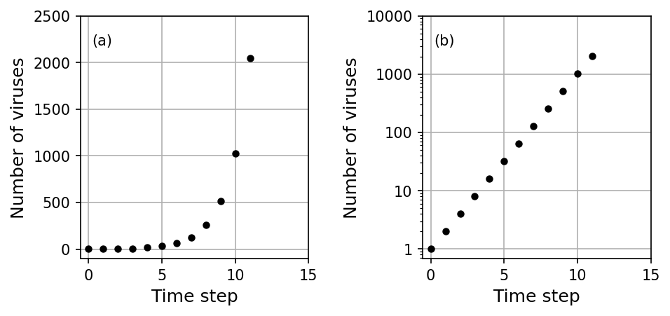
The data above represents number of viruses relative to the doubling time (time step) for which the virus can multiply. Initially there is very little virus, but as the virus infects cells and used them to reproduce, the number of viruses quickly grows.
Figure (a) shows the amount of virus using a linear scale, where the amount of virus is not noticable until \({\gtrsim}5\) time steps.
Figure (b) shows the amount of virus using a logarithmic scale, where the change in the amount of virus is much more noticeable.